


Ashley is a graphic designer and illustrator. Her work captures a brand’s personality with joy and whimsy.
Current & Previous Clients


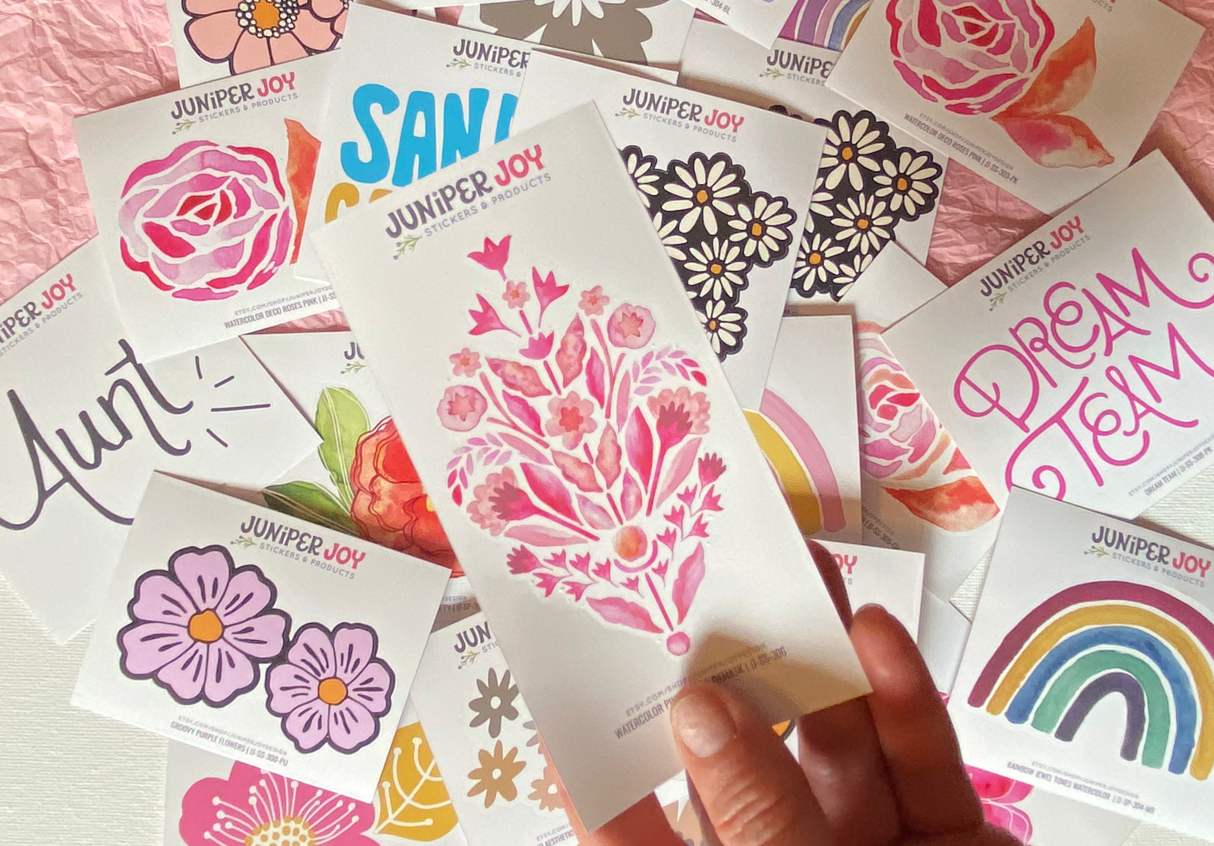
Follow @Juniper_Joy
Current & Previous Clients